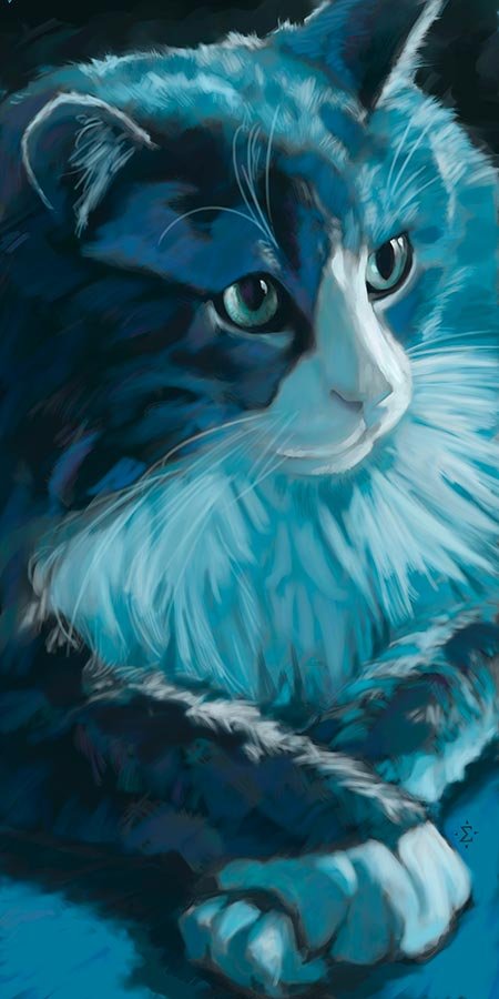
Most of my portrait work consists of dog portraits, but I’ve done a few cat portraits as well.
A couple weeks ago I was feeling the need to work on a cat portrait as a nice change of pace. At that same time, a friend posted a photo of her cat on Facebook. I liked the photo and knew it would make a great practice portrait.
Legally, I can’t just use reference photos without the permission of the owner, so I sent her a message asking if I could use her photo as reference for some “feline practice”. She agreed.
I wasn’t looking to make a faithful representation of the colors. The cat was mostly gray. But the lighting on the eyes was very dramatic and the pose overall was quite interesting, so I decided to make the portrait a mono-color portrait in blue. This allowed me to work on the composition and dramatic lighting and not worry too much about the color accuracy.
One of the rules of painting I try to follow is that specific colors don’t matter, as long as you get the value correct. This is a general rule, and I’ve tried it before and it seems to work.
This is why I generally convert the reference image to black and white before starting the painting. Doing so simplifies the image to one based on a value scale (gray values from black to white).
Focusing on values allows me to ignore the specific colors of the photo and choose the colors based on what works in each painting. If I can create the values of whatever color I use to match the value scale of the black and white photo, and everything else is working, the final painting is usually a success.
Of course, I usually don’t go too far afield from the actual colors of the subject. This painting is the exception. As an experiment, I think this is a good success, and it shows the potential for more “value-based” paintings.


